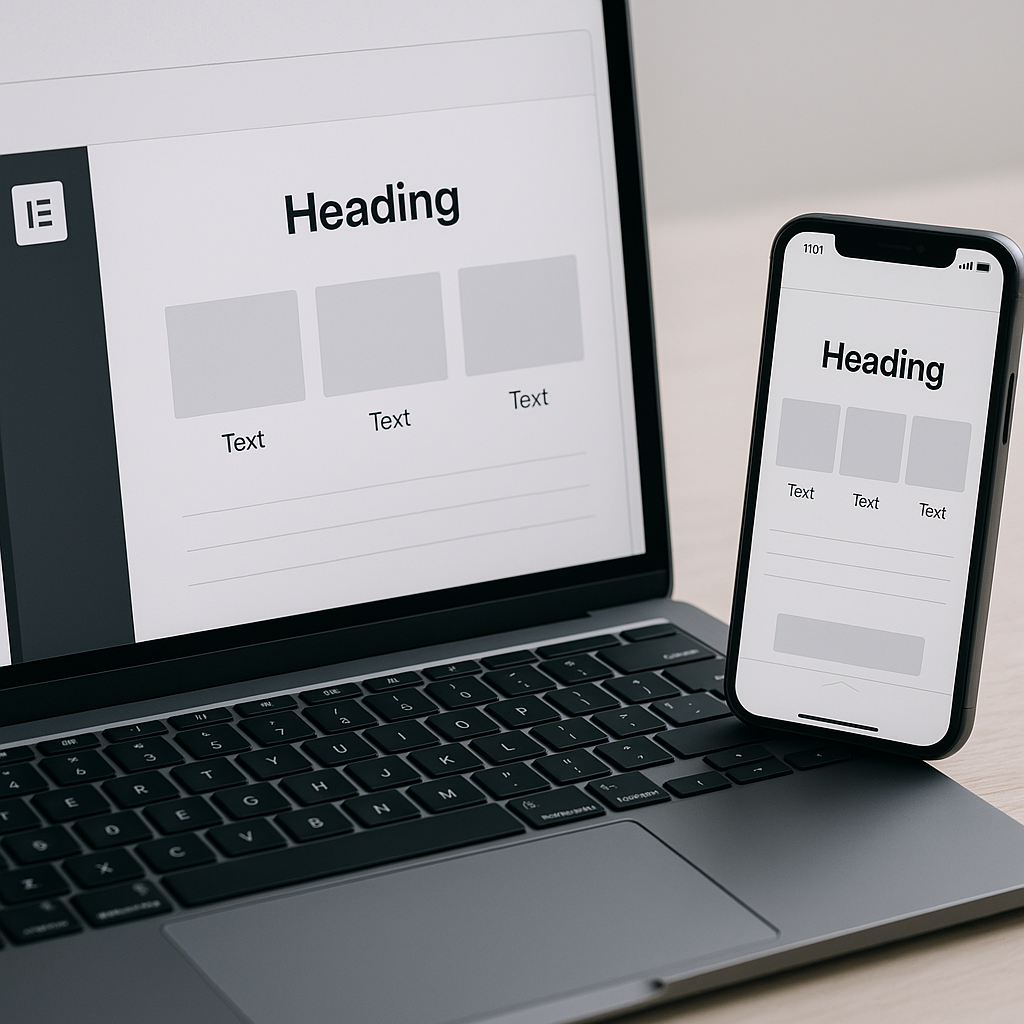
Ensuring your website looks great on mobile devices is crucial, especially as more users conduct online searches and purchases on their smartphones. Elementor, a leading page builder for WordPress, offers various tools to enhance mobile responsiveness. This guide will provide actionable steps to maximize your site’s mobile-view experience, ensuring it not only looks good but functions well for users on all devices.
Understanding Mobile Responsiveness
Mobile responsiveness refers to how well your website adapts to different screen sizes and device types. A mobile-responsive site adjusts its layout, images, and functionalities to fit a user’s device, ensuring a seamless experience. This becomes essential, as failing to optimize for mobile can increase bounce rates and negatively impact your site’s overall performance.
Getting Started with Elementor
Elementor provides an intuitive interface that allows you to customize your website’s design without needing to code. Here are some fundamental steps to begin ensuring your site is mobile-responsive:
- Install and Activate Elementor: Make sure you have Elementor installed on your WordPress site. You can find it in the WordPress plugin repository.
- Select a Theme: Choose a WordPress theme that is compatible with Elementor and built with mobile responsiveness in mind.
- Create a New Page: Start by creating a new page or editing an existing one using Elementor.
Utilizing the Responsive Editing Tools
Elementor provides several tools to ensure your design is responsive. Here’s how to use them:
Responsive Mode
Elementor has a built-in responsive mode that allows you to switch between different device views (desktop, tablet, and mobile). To enable this:
- Open the Elementor editor, and look for the responsive mode icon at the bottom of the left panel.
- Choose between Desktop, Tablet, or Mobile views.
This feature gives you the ability to see how your design appears on different devices and make necessary adjustments on the fly.
Adjusting Layout Settings
When editing any section or widget, you can customize its layout settings specifically for mobile:
- Click on the section or widget you want to adjust.
- Go to the Advanced tab in the left panel.
- Under Responsive, you can set options such as hiding the element on specific devices.
Consider hiding large images or complex sections that wouldn’t translate well onto smaller screens.
Style Settings
Adjust typography and spacing for better readability on mobile. To do this:
- In the Elementor editor, select a text widget.
- In the Style tab, adjust font size, line height, and text alignment.
- Ensure that padding and margin settings are coherent with mobile formatting.
For example, increasing line heights can enhance readability, while reducing padding will provide more content space.
Testing Mobile Responsiveness
It’s essential to test your website across various devices and browsers to ensure everything looks and operates smoothly. Utilize tools such as:
- PageSpeed Insights to check loading speed and responsiveness.
- Web.dev for guidelines that aid in creating an overall responsive design.
- Browser developer tools to simulate different mobile devices.
Make sure to review and optimize any elements that don’t perform as expected during these tests.
Common Mistakes to Avoid
While it’s easy to overlook certain aspects of mobile design, being aware of common mistakes can save time and improve your site’s user experience:
- Neglecting Testing: Always test your site on real devices to see how it performs, as emulators can be inaccurate.
- Overloading with Graphics: Heavy images can slow down mobile loading times. Use optimized images and avoid large files.
- Ignoring Touch Targets: Ensure buttons and links are large enough for users to click easily on mobile devices.
Best Practices for Mobile Optimization
To boost your site’s mobile usability further, consider these best practices:
- Utilize Large Fonts: Text should be easily legible without zooming.
- Keep Navigation Simple: Use clear menus and a logical structure to facilitate easy navigation on mobile.
- Optimize Images: Use formats like WebP for faster loading times and responsive image techniques.
- Limit Pop-ups: Mobile users find pop-ups frustrating; use them sparingly to avoid user drop-off.
Maintaining Performance and Speed
Website speed plays a significant role in mobile responsiveness. To enhance speed, consider:
- Implementing website speed optimization techniques.
- Utilizing caching plugins compatible with Elementor.
- Employing a content delivery network (CDN) like Cloudflare.com/”>Cloudflare to reduce latency.
Conclusion
Creating a mobile-responsive website using Elementor doesn’t have to be overwhelming. By understanding the tools available and following the outlined practices, you can ensure that your site is welcoming and functional for mobile users. Regularly testing your design and making necessary adjustments will promote an engaging user experience that keeps your visitors coming back.
Frequently Asked Questions
How do I know if my site is mobile-responsive?
You can use tools like Google’s Mobile-Friendly Test. Simply enter your URL, and it will provide insights into your site’s responsiveness.
Why does mobile responsiveness matter?
With a significant amount of web traffic coming from mobile devices, a non-responsive site can lead to higher bounce rates and lower conversions.
Can I customize every section for mobile separately in Elementor?
Yes, Elementor allows different customizations for desktop, tablet, and mobile views within the same section or widget.
What should I do if my site is not mobile-responsive?
You can adjust the settings in Elementor and consider hiring professional WordPress services to enhance mobile responsiveness and overall performance.